CSS Grid layout support was rolled out last year and it is a powerful way to handle grid based layouts. It eliminates the hacks that interface designers used in the past like tables, floats, etc to create grid based designs.
I have been experimenting with CSS Grid and want to share a few things that I have learned so far. This article will walk you through building a magazine/blog layout using CSS Grid.
Basic knowledge of CSS and HTML will be a plus to understand this article easily, but even if you are new to web development you can follow along without difficulty.
A multi-column grid layout
I will be building a multi-column landing page/home page of a magazine/blog website. It will have the basics, like the header navigation, featured posts, recent posts, footer, etc.
Here is a screen shot of the final results.
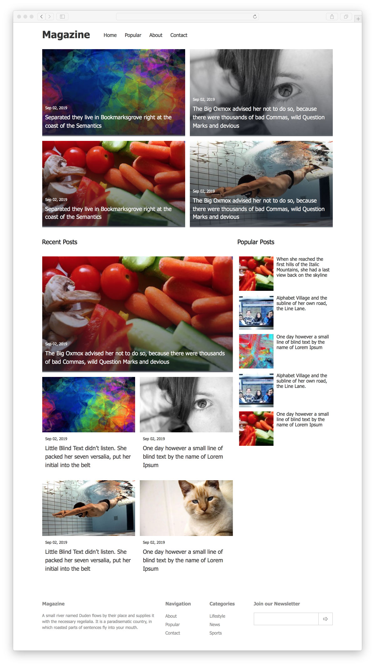
Final Magazine Layout
The Grid Container: Body
CSS Grid layout allows us to have multiple grids, or grids within grids. An element can be made into a grid container by applying the property display:grid;. All the direct children of the grid container becomes grid cells, and can be placed anywhere on the grid.
Lets define our main grid:
<body class="grid">
.grid {
    display: grid;
	grid-template-columns: repeat(12, 1fr);
}
So what does this code do? The code is easy to read and understand. Here, display: grid; tells the browser that the element with the class .grid is a grid container. It is a new display type introduced for CSS Grid layout.
After that, we are defining the number of columns for the grid using grid-template-columns:. I want to have 12 columns. It doesn’t have to be 12, you can have 10, 8, or 2 columns. CSS Grid layout introduced the ‘fr’ or fraction unit, which allows us to divide the columns, or rows into fractions.
grid-template-columns: 1fr 2fr;
For the above code, the browser will divide the total available horizontal area into two columns with the first column having 1/3 of the available horizontal area and the next column with 2/3.
If you want to have three or more columns with equal width, you would write something like:
grid-template-columns: 1fr 1fr 1fr;
You can see how it works. If you want multiple columns with equal widths the repeat() function allows you to easily do this without having to write 1fr multiple times. It takes two values, the number of repeats followed by the pattern to repeat. It can be an fr unit, a fixed pixel value, etc. You can read more about it at MDN.
Back to our layout, This is the grid our code generates.
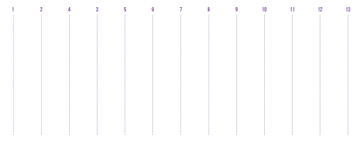
Grid lines
As you can see, I have added some numbers to the grid lines. Those numbers are importent when placing grid cells on the grid using grid-column:. Grid rows can be defined similarly too. A two column grid has three grid lines 1, 2, 3. A four column grid has five grid lines, you get the idea.
Tip: Firefox has a neat feature, where you can toggle a grid highlighter from Inspector.
The header
I want a basic header with the website name and navigation. A two column layout.
Here is the markup for the header:
<header class="page-header">
    <h1><a href="">Magazine</a></h1>
    <nav class="page-header__nav">
        <ul>
            <li><a href="">Home</a></li>
            ...
        </ul>
    </nav><!-- /.page-header__nav -->
</header><!-- /.page-header -->
We are going to place the header element on the grid, and make it appear center aligned on the page. To achieve this we can leave one empty column on either side of the element.
In the below code, I have defined the area so that the element starts at grid line two and ends at grid line 12, leaving an column on each side. You can use -2 instead of 12 as well, it will work just fine. What do I mean by -2 you ask?, well the below code and this grid-column: 2 / -2; will give the same result.
.page-header {
  grid-column: 2 / 12;
}
Now that the header element is placed in the right place. We could either use floats, or flexbox, or define another grid inside header element. Since this is for practicing grid, I will use grid, even though, flexbox probably will be better for this situation, since its a two column single row layout.
.page-header {
    grid-column: 2 / 12;
    display: grid;
    grid-template-columns: 1fr 4fr;
}
This code get us the results we want. You can see below how it appears on firefox with grid highlighter on.

Header section on browser
The header needs to be responsive too. Instead of defining specific viewport sizes for mobile, tablet, and desktop, I like to see the width at which the layout breaks, or the width at which I want to change the layout. This way it looks good on all screen sizes.
I want to have full menu displayed on mobile, so I decided to go with a two row layout for smaller screens. We can achieve this with a little modification to our code.
.page-header {
    grid-column: 2 / 12;
    display: grid;
    grid-template-columns: 1fr 4fr;

    @ media( max-width: 675px ) {
        grid-template-columns: 1fr;
        grid-column: 1 / -1;
        padding: 0 15px;
    }
}
The media query overrides the previously defined grid-template-columns:. You can have two media queries too, if you want. A min-width and a max-width targeting 674px and 675px respectively.
The second and third lines in the media query is to place the header with the full width of the grid and to give it a padding on both sides, instead of an empty column.
The Body
I want to have three sections in the body. A full width featured/sticky posts section and two columns below that for recent posts and a sidebar for popular posts.
<main class="page-main">
        <section class="sticky-posts">
            <article class="sticky-posts__item">
                <a href="" class="sticky-posts__item-img">
                    <img src="./placeholders/img1.png" alt="">
                </a><!-- /.sticky-posts__item-img -->
                <div class="sticky-posts__item-body">
                    <span class="sticky-posts__item-meta">Sep 02, 2019</span><!-- /.sticky-posts__item-meta -->
                    <h3><a href="">Separated they live in Bookmarksgrove right at the coast of the Semantics</a></h3>
                </div><!-- /.sticky-posts__item-body -->
            </article><!-- /.sticky-posts__item -->
            ...
        </section><!-- /.sticky-posts -->
        <section class="recent-articles">
            <div class="recent-articles__recent">
                <article class="recent-articles__recent-item">
                    <a href="" class="article-box__img">
                        <img src="./placeholders/img1.png" alt="">
                    </a><!-- /.article-box__img -->
                    <div class="article-box__body">
                        <span class="article-box__meta">Sep 02, 2019</span><!-- /.article-box__meta -->
                        <h3><a href="">The Big Oxmox advised her not to do so, because there were thousands of bad Commas, wild Question Marks and devious</a></h3>
                    </div><!-- /.article-box__body -->
                </article><!-- /.recent-articles__recent-item -->
                ...
            </div><!-- /.recent-articles__recent -->
            <div class="recent-articles__popular">
                <ul>
                    <li class="recent-articles__popular-item">
                        <a href="" class="recent-articles__popular-item-image">
                            <img src="./placeholders/img1.png" alt="">
                        </a><!-- /.recent-articles__popular-item-image -->
                        <div class="recent-articles__popular-item-body">
                            <h3>When she reached the first hills of the Italic Mountains, she had a last view back on the skyline</h3>
                        </div><!-- /.recent-articles__popular-item-body -->
                    </li><!-- /.recent-articles__popular-item -->
                    ...
                </ul>
            </div><!-- /.recent-articles__popular -->
        </section><!-- /.recent-articles -->
    </main><!-- /.page-main -->
FYI, the dot dot dots in the code is just repeat items in the lists.
To place it on the grid, we will do the same thing as we did with the header section.
.page-main {
    grid-column: 2 / 12;

    @ media( max-width: 675px ) {
        grid-column: 1 / -1;
        padding: 0 15px;
    }
}
But, unlike with the header, we are not going to make the main element a grid. Instead, we will be making the direct children of the main element as grid containers where nessessary.
The .sticky-posts element is the featured section, and it will have two columns.
.sticky-posts {
    display: grid;
    grid-template-columns: 1fr 1fr;
    grid-gap: 15px;

    @ media( max-width: 675px ) {
        grid-template-columns: 1fr;
    }
}
The only property here, which was not used before is grid-gap:, which adds a gap/space between grid cells. It is a shorthand property for grid-row-gap: and grid-column-gap:. I want to allow for more than two posts in this section and also on mobile it will have a single column, so grid-gap: shorthand is used here.
Here is how the featured posts look now.
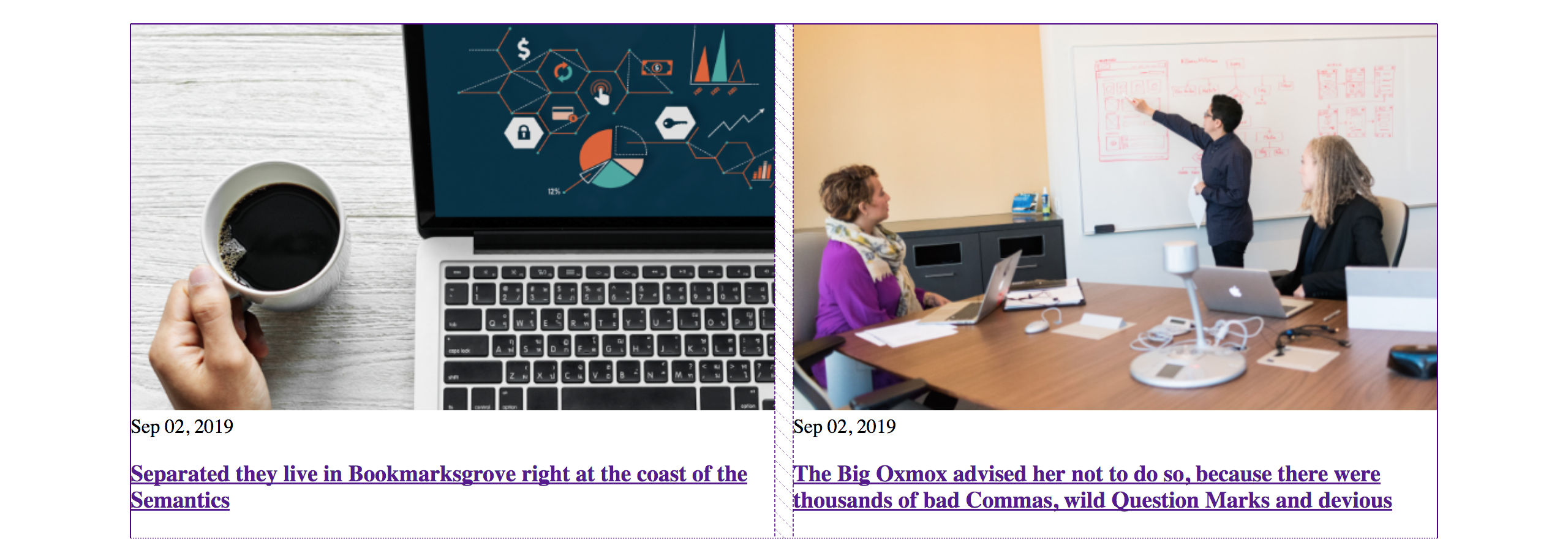
Featured articles section on browser
For .recent-articles section, lets imagine it takes up three columns, two of which is for .recent-articles_recent and one is for .recent-articles_popular. The .recent-articles_recent is again divided into two columns. You will understand better when you see the code.
.recent-articles {
  display: grid;
  grid-template-columns: 2fr 1fr;
  grid-gap: 15px;
    @ media( max-width: 940px ) {
        grid-template-columns: 1fr;
    }
}

.recent-articles__recent {
  display: grid;
  grid-template-columns: 1fr 1fr;
    @ media( max-width: 675px ) {
        grid-template-columns: 1fr;
    }
}
.recent-articles and .recent-articles_recent has a single column for viewports below 940px and 675px respectively, to allow for max width elements.
I want the first article in the .recent-articles_recent to be highlighted by taking up the full width of the section. When doing this we have to keep in mind that the grid container changes the number of columns for smaller screens. So we will only target above that screen size to take up two columns as shown below.
.recent-articles__recent-item--first {
  @ media( min-width: 674px ) {
     grid-column: span 2;
  }
}
The sidebar for popular posts has different layouts for different screen sizes as shown below. The code is easy to understand and follow.
.recent-articles__popular {
    @ media( max-width: 940px ) {
        ul {
            display: grid;
            grid-template-columns: 1fr 1fr;
            grid-gap: 15px;
        }
    }

    @ media( max-width: 675px ) {
        ul {
            display: grid;
            grid-template-columns: 1fr;
            grid-gap: 15px;
        }
    }
}
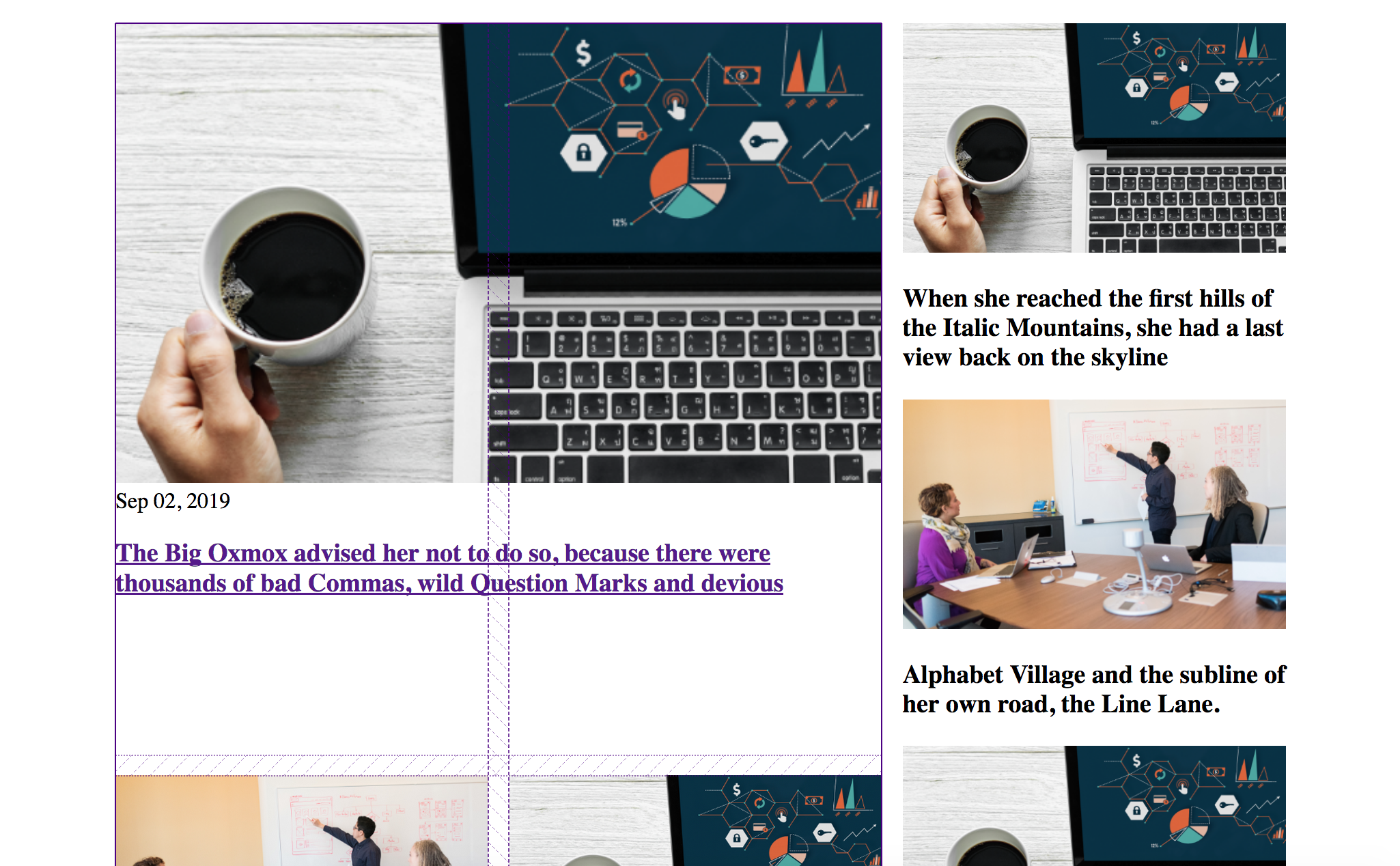
Recent articles section on browser
Our page is looking good now. As you can see from the picture, the first post in recent posts takes up two columns.
The footer
The footer will be very simple to make at this point.
<footer class="page-footer">
        <div class="page-footer__copy">
            <span class="logo">Magazine</span><!-- /.logo -->
            <p>A small river named Duden flows by their place and supplies it with the necessary regelialia. It is a paradisematic country, in which roasted parts of sentences fly into your mouth. </p>
        </div><!-- /.page-footer__copy -->
        <div class="page-footer__links">
            <h4>Navigation</h4>
            <a href="">About</a>
            <a href="">Popular</a>
            <a href="">Contact</a>
        </div><!-- /.page-footer__links -->
        <div class="page-footer__categories">
            <h4>Categories</h4>
            <a href="">Lifestyle</a>
            <a href="">News</a>
            <a href="">Sports</a>
        </div><!-- /.page-footer__categories -->
        <div class="page-footer__newsletter">
            <h4>Join our Newsletter</h4>
            <form action="">
                <input type="email" name="" id="">
                <button></button>
            </form>
        </div><!-- /.page-footer__newsletter -->
    </footer><!-- /.page-footer -->
I want to have four columns on desktop and two when its 940px and one column on screens smaller than 675px.
We will use fr units to have different sizes of columns on the desktop to accommodate the type of content that goes into each column.
.page-footer {
    grid-column: 2 / 12;
    display: grid;
    grid-template-columns: 3fr 1fr 1fr 2fr;
    grid-gap: 15px;

    @ media( max-width: 940px ) {
        grid-template-columns: 1fr 1fr;
    }

    @ media( max-width: 675px ) {
        grid-column: 1 / -1;
        padding: 0 15px;
        grid-template-columns: 1fr;
    }
}
Here is the result:
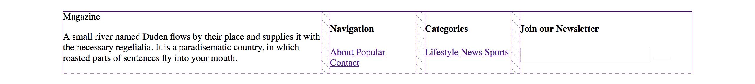
Footer section on browser
Our layout is complete, and its responsive. But it is just bare bones at this point, and needs a new coat of paint. Here is a Codepen of the final code with additional styles to give it a finishing touch.
I know I have explained the code less and less as I went further down the article, this was because the same properties were used to create similar results in each section. If you need further explanation about how I did a perticular thing, feel free to use the comments section to ask.