Project Breif: Advanced Publishing/Branding Stream.
Requirement: You are required to design materials for an exciting upcoming Ray Wijewardene exhibition. The exhibition is primarily aimed at the general public but there will also be a private view inviting the public figures and celebrities to attend.
Team: Ahmed Naxeem, Dinika Godakumbura and Chalani Ramanayeka - “The Flying Coconuts”
Concept: We did research about Ray Wijewardene and came up with a few concepts for the project. The final one was looking at Ray’s life through a Kaleidoscope, as Ray was into a lot of different things.
Exhibition Title/Logo

Logo
Ray being an engineer, math and geometric shapes were a part of his everyday life. A lot of math and shapes were behind all those helicopters that he designed.
Inspired from this we decided to use Geometric shapes to create the three letters that make up his name and use it as a logo.

Logo usage
We combined this concept of using geometric shapes with our main concept for this project, viewing Ray’s life as a Kaleidoscope.
We thought that the workings of a Kaleidoscope speak a lot about how all the disciplines that he was involved in came together.
Inspired from all the patterns created by Kaleidoscope, we created a grid using triangles. This grid was used to create the lettering for the logo. Different colors were used to represent all the disciplines that he had and to show the mixing of it.
Promotional Materials
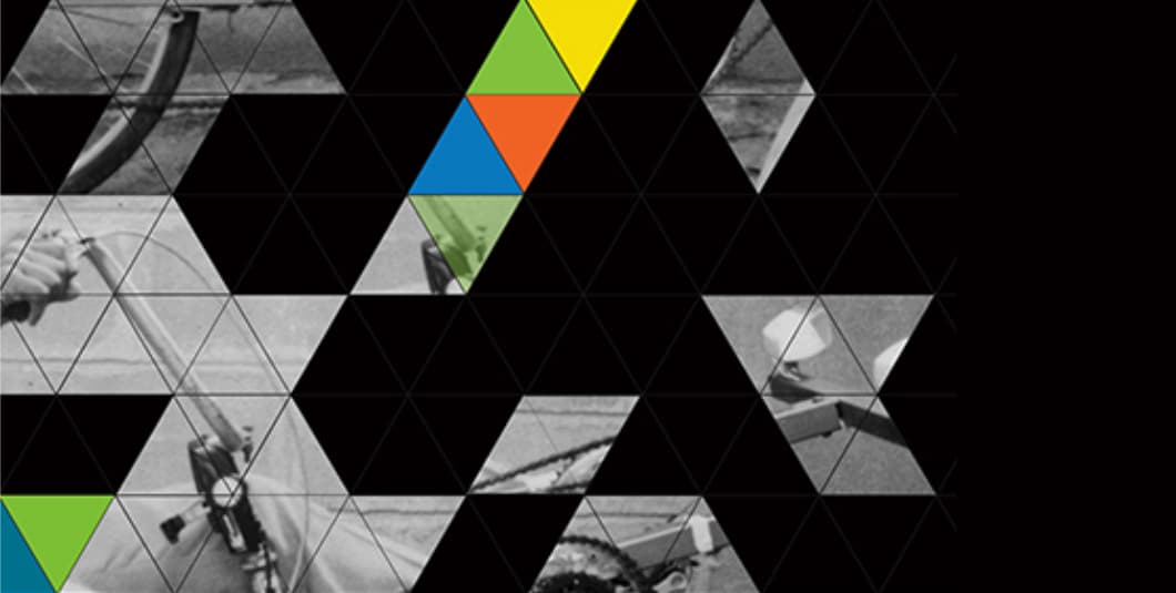
To promote and advertise the exhibition we decided on designing three posters. For the posters we went with a kaleidoscopic effect, using photographs of inventions by Ray. We have used the triangles shapes and divided the photographs into triangles and made different patterns to show the kaleidoscopic effect. We made Background of the posters black and the photographs gray scale and we used a few triangles with the corporate colors. Also, at the bottom of all three posters we will be including the information about the exhibition and also, a small description on the invention shown from the photograph.
The distorted nature of the images in the poster was to create a sense of curiosity in the viewers.

Poster 1

Poster 2

Poster 3
Another way we thought to promote the exhibition was by creating a Facebook page. We didn’t want to use the exhibition logo everywhere so we used elements from it, making different patterns.

Facebook page branding
Signage - Way Finding

Signage 1
Small pyramids placed throughout the exhibition area to help people find their way around. These pyramids were color coded according to the part of the exhibition.

Signage entrance

Way finding poll

Information panel
Panel with a picture of Ray working and text describing what it is. Similar panels placed throughout the exhibition space to display Ray's work.

Branded seating area.

Floating triangles.

Branded Yact.
Branded Yacht, the visitors can go for a Yacht ride on the lake inside the exhibition area.

Exhibit Information.
Direct Mailer
For the VIP Invitations we made a Kaleidoscope, the color being black with our exhibition logo on one side with the tag line 'A man with a vision' underneath it and including triangles with the corporate colors. On the other side, we had the invitation wordings. To package the kaleidoscope and make it presentable, we used a black box which was the ideal height and width of the kaleidoscope.

Direct Mailer.

Direct Mailer.

Direct Mailer.
Ray Wijewardene was a scientist, engineer, inventor, innovator, aviator, mechanical engineer, agricultural engineer, Olympic athlete and above all he was a loving husband and a father to his family. Ray Wijewardene invented the two-wheeled tractor and built many helicopters.

